SCROLL TO EXPLORE

Introduction of this task
The placing order flow had become outdated and no longer met current user needs. Recognizing its importance, Anfin redesigned the flow to be more intuitive and user-friendly.
Problem
The current placing order flow existed since the beginning. As a result, it no longer resonated with users and contained several issues, including inconsistent transaction recording, poor user experience, and a lack of clear order descriptions.
Soltuion
Anfin aims to attract new users and retain existing ones, especially within the younger user segment. The redesigned order flow is now simpler, more user-friendly, and provides sufficient information. Additionally, we incorporated smart rules and mechanisms to support users even in situations they may not anticipate.
PROJECT OBJECTIVES
The product goal is responsible for balancing both the user goal and the business goal.
USERS GOAL
Minimize repetitive confusion and curiosity when using the Anfin app.
Need a simple order placement flow with clear information and well-structured content that is easy to read without effort.
PRODUCT GOAL
Detect and evaluate current problems to resonate with users’ needs
Subtly convey the business’s intentions through indicators, order type descriptions, and other key elements Anfin wants users to be aware of.
Release a new interface that is not only informative but also provides a seamless experience without barriers.
BUSINESS GOAL
Improve the UI and UX to increase user retention and attract more new users.
Introduce more order types — such as ATO, ATC, off-hour trading, and low-liquidity stocks — with clear, easy-to-understand explanations.
Address existing flaws, including: such as: Lack of detailed order information, difficulty accessing stock details, no explanations for abnormal trading cases
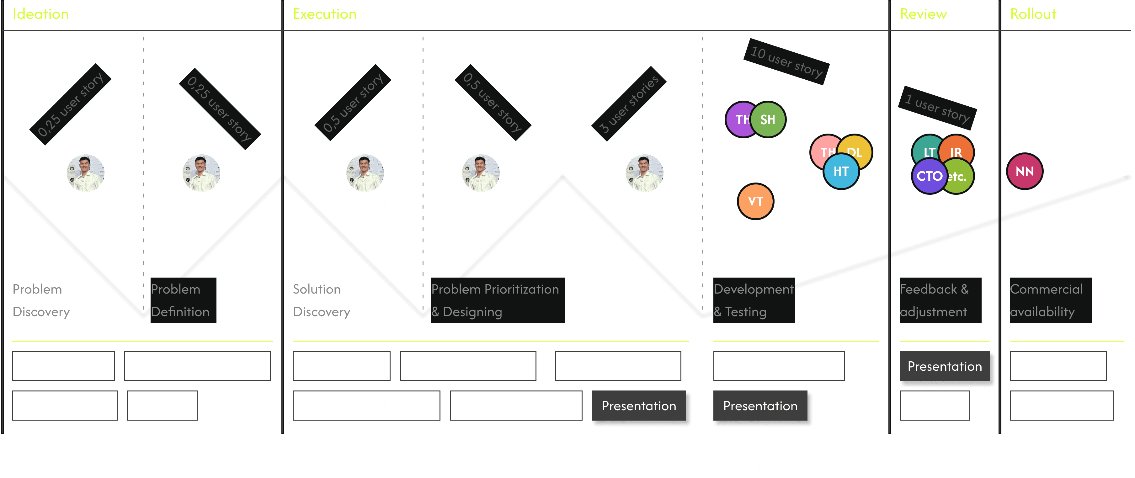
TEAM PROCESS
Depending on each project, we will choose a different management approach, the Scrum Philosophy was applied for this project
Following Lean UX, we simplify tasks to reduce complexity and costs, avoiding unnecessary features.
The process may take longer due to factors like validation, challenges, or necessary iterations
(*) 1 user story = 8 hours
PRODUCT

Product Owner
Tai Truong
me
Designer
Tai Truong
me
TECH
TH
BE Developer
Tan Huynh
SH
BE Developer
Son Ho
HT
Mobile dev
Huy Tran
DL
Mobile dev
Duy Le
TH
Mobile dev
Tan Hoang
QC/QA
VT
Tester
Van Tran
STAKEHOLDERS/ REPORTER
HN
CTO
Hiep Nguyen
HN
Sales team
Hao Nguyen
GN
Investor regulation
Giang Nguyen
etc.
Other teams
Tri, Dat, Tan,...
DATA TEAM
NN
Data team
Nhu Nguyen
LET'S GO AROUND MY PROCESS
PROBLEM DISCOVERY
UX Audit (You start here)
User Interview
Competitor Audit
PROBLEM EXPLORATION
Qualitative result
Quantitative result
SOLUTION & DESIGN
Problem Prioritization
UI Iteration
UI Final
REQUIREMENT & DEVELOPMENT
Adjust order matching mechanism
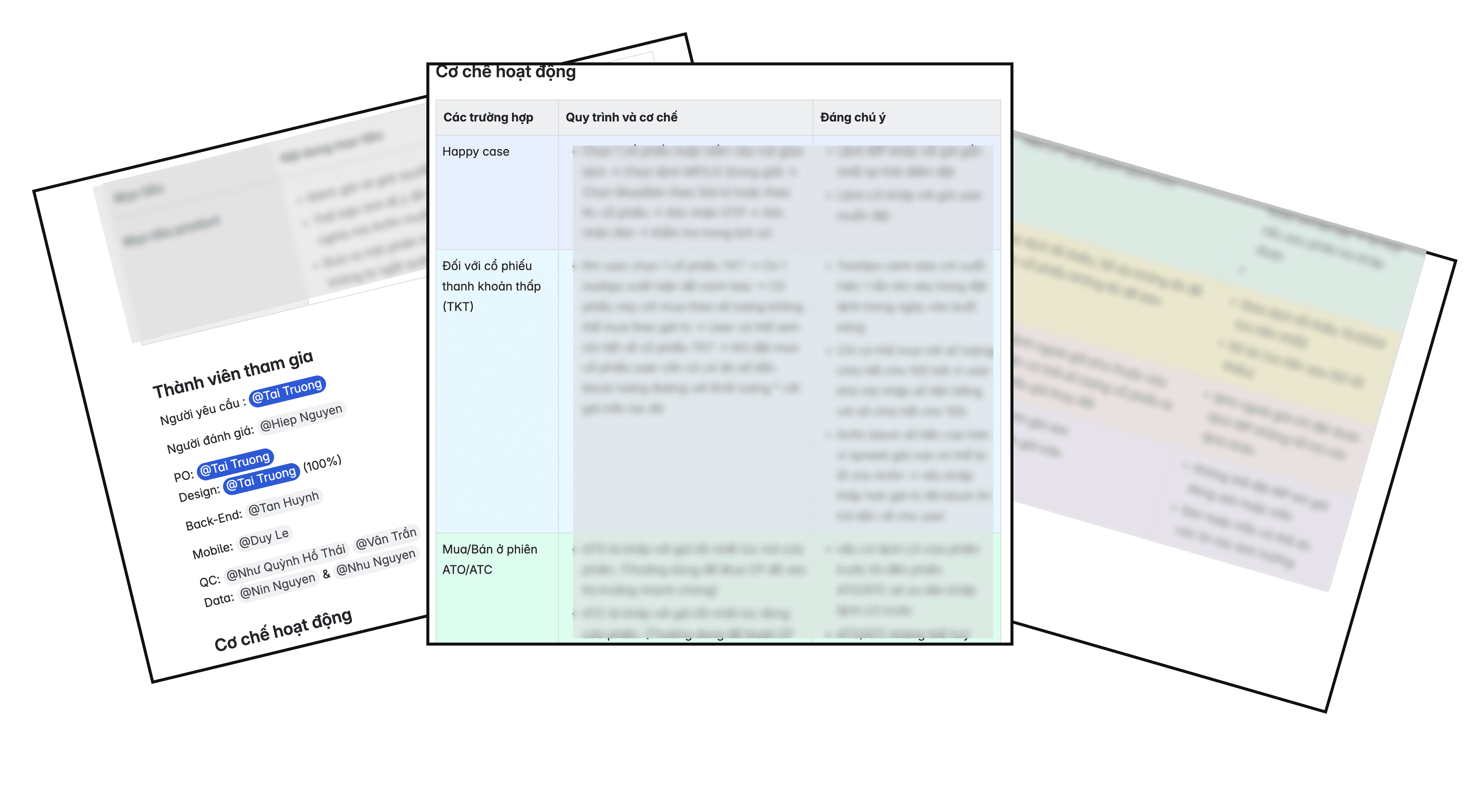
Document & Requirement
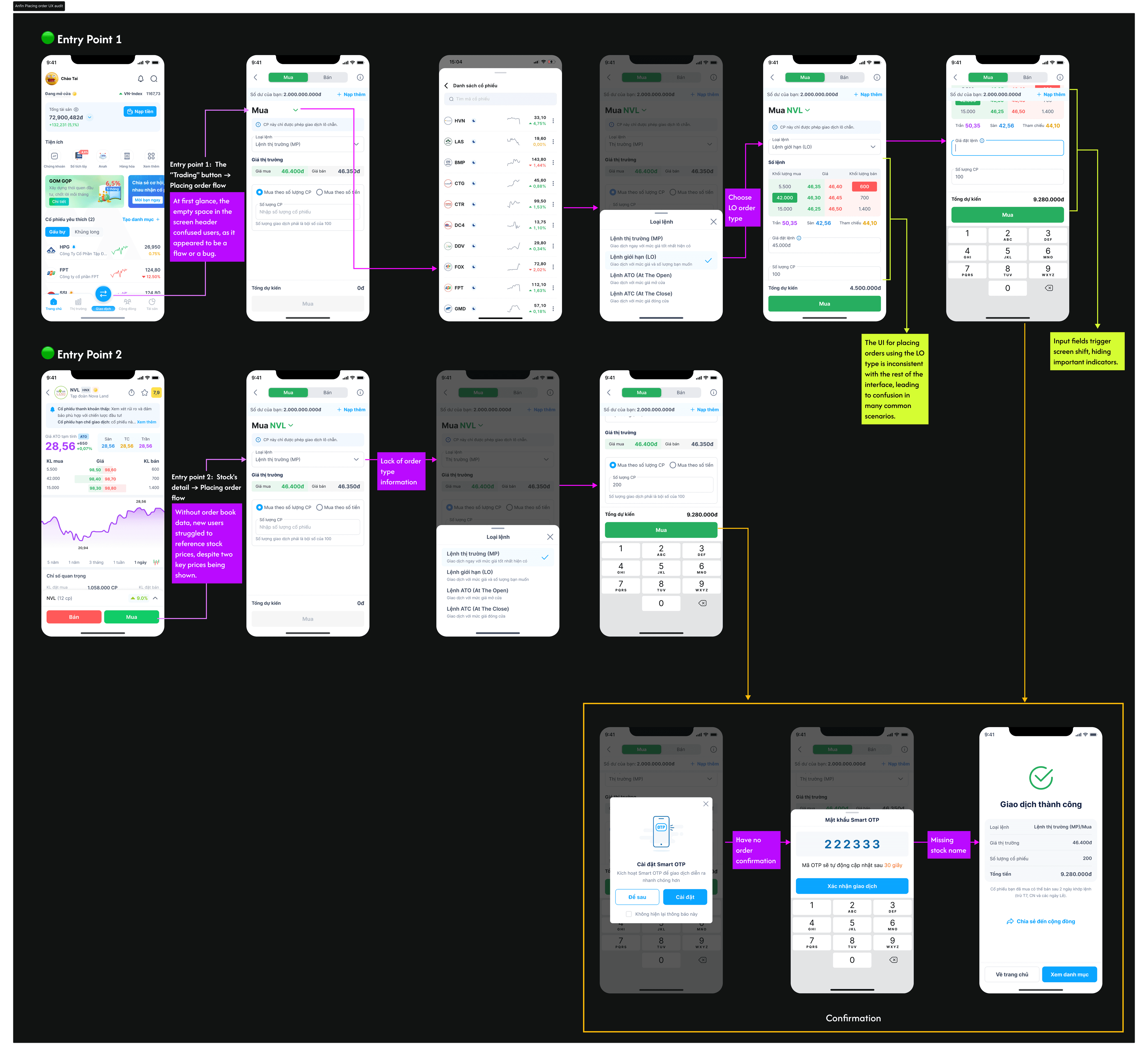
Problem discovery / UX Audit
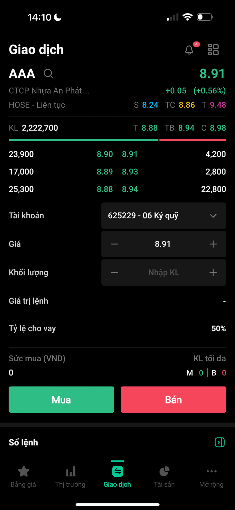
PLACING ORDER FLOW
(*) This is just serve for the happy case. Due to the NDA, I’ve only summarized some of the screens. There were many issues involving multiple departments.
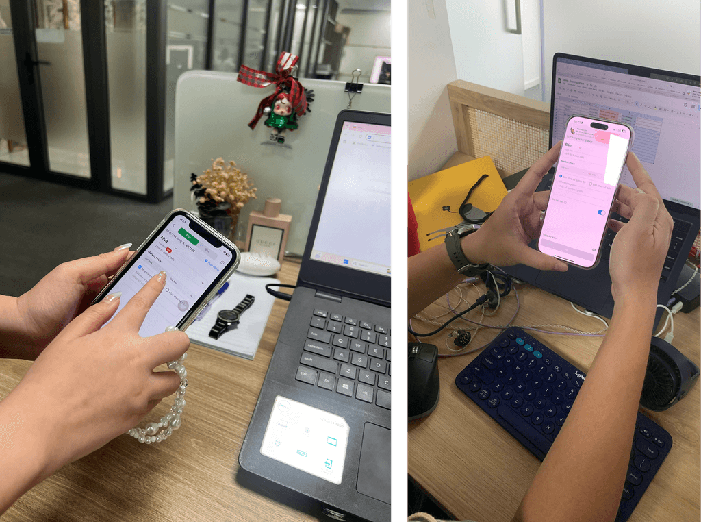
Problem discovery / User Interview
INTERVIEW USERS
In the office, there are some members who are also Anfin users, working in other industries such as marketing, legal, and sales,…
INSIGHT
Experienced Users:
Found the available information sufficient for their needs.
Occasionally encountered a few system-related bugs.
Sometimes felt confused when choosing between "buy by number of shares" and "buy by amount."
Some users tended to go back to the detail page to check the stock price and order book.
Wanted confirmation about the order they placed.
New Users:
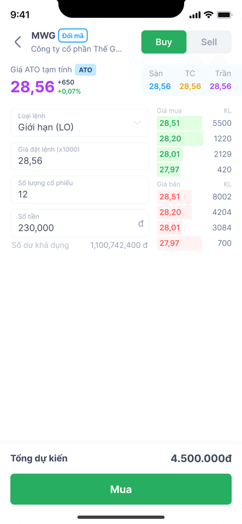
Most participants asked why there was an empty space in the header of the feature (refer to entry 1 of UX Audit task)
Found many pieces of information unclear or difficult to understand, which caused confusion.
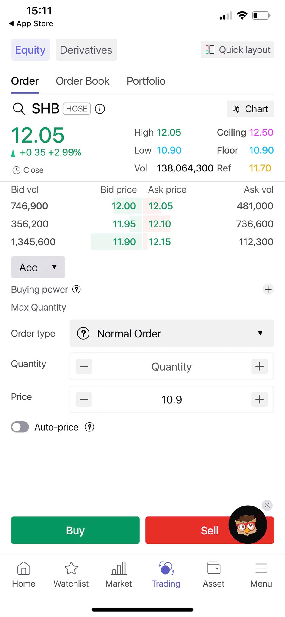
Problem discovery / Competitive Audit
This App belongs to one of the biggest finance organization in Viet Nam, which is used by the large number of users.
✅ PROS
Feature-rich interface
Offers enough information for traders such as: Buy/Sell; stock information; order book;…
Simple action button ("Đặt mua")
The "Dư mua / Dư bán" (Buy vs. Sell) bar at the bottom with percentage split (33% vs 67%) gives a quick market overview in a visual way.
Guided input
Users can increase/decrease price and volume with “+ / –” buttons, which is safer than typing manually for beginners.
Quick percentage buttons (25%, 50%,…)
Trust-building
Branding and layout feel mature and reliable.
❌ CONS
No confirmation preview before “Đặt mua”
Beginners might tap accidentally without seeing a summary of what they’re about to place.
Busy layout
Dense with icons, data, and buttons—reduces focus and increases cognitive load.
The order book are located at the bottom, which is one of the key factor for traders
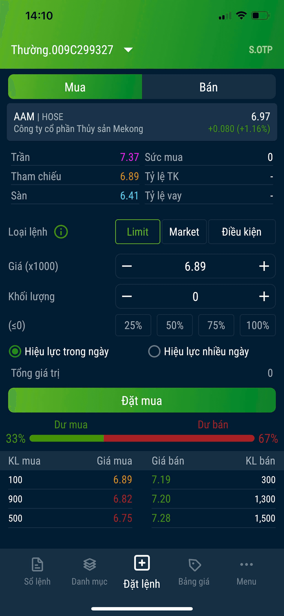
One of the big companies in stock investment, which is used by a lot of Vietnamese Traders
✅ PROS
Minimal interface
The layout is clean and modern, with plenty of spacing and good contrast, which reduces visual clutter.
Large, clear buttons
"Mua" (Buy) and "Bán" (Sell) are clearly recognized with green and red, making it easy to choose an action confidently.
Auto-Fill and step buttons
“+” and “–” allow users to easily adjust price and quantity without manual input, which is less error-prone.
Stock information
Enough indicators and inforamtion for traders
❌ CONS
No quick action
Users need quick percentage actions (e.g., 25%, 50%) based on their balance to reduce input time.
Limit order types
Not offer Market, Stop, or Conditional orders, limiting flexibility.
The official trading app by SSI Securities, one of Vietnam’s top investment firms, which is my most inspired
✅ PROS
Clear Interface
The layout is spacious and modern, using white background and high-contrast elements (green/red), minimizing visual overload.
Enough necessary stock information
The layout allows for a smooth visual flow from top to bottom, guiding users from information to action seamlessly.
Guided Input
Step “+” and “–” buttons let users adjust values without typing, reducing error risk.
Supporting buttons/action
"Quick layout" to change to another layout
"Chart" in charge of showing stock's chart quickly
Market section: open or close
and etc….
❌ CONS
Busy Layout
Offer too many features and datas, there are much of information that needs to be explained
The hierarchy is supposed to be a bit narrow between sections.
Problem exploration
QUALITATIVE RESULT
The current UI has become outdated over time.
There is a lack of explanation for key terms and indicators, which makes it difficult for users, especially newbies, to fully understand and navigate the app.
While existing users have already learned how to complete the order placement flow, this familiarity creates a barrier for onboarding new users, as the flow is not intuitive without prior knowledge.
To support business goals, Anfin has introduced new order types (ATO, ATC, MKT, LO, etc.) and additional information (such as low-liquidity stocks, trading hours, etc.), which requires a more user-friendly interface with clear and sufficient guidance for traders.
Currently, features such as order confirmation and transaction details lack proper explanation.
QUANTITATIVE RESULT 😢
Unfortunately, before I joined Anfin, the team hadn’t implemented event tracking, so I didn’t have the data needed for calculations.
There’s only the number of transactions available, which I'm not allowed to share.
YOU ARE BEING MOVED TO THE NEXT STEP
PROBLEM DISCOVERY
UX Audit
User Interview
Competitor Audit
PROBLEM EXPLORATION
Quantitative result
Quanlitative result
SOLUTION & DESIGN
UI Iteration
UI Final
REQUIREMENT & DEVELOPMENT
Adjust order matching mechanism
Document & Requirement
Solution & Design / Iterations
CREATE MANY OPTIONS
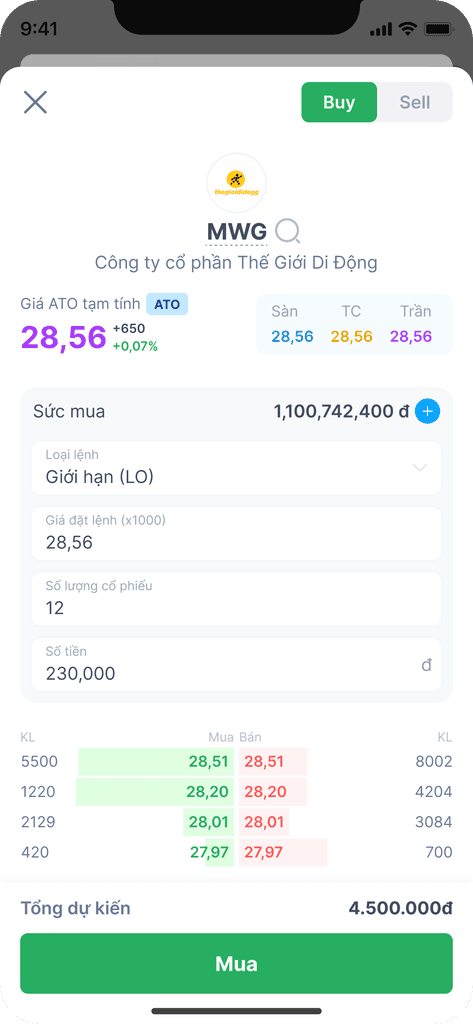
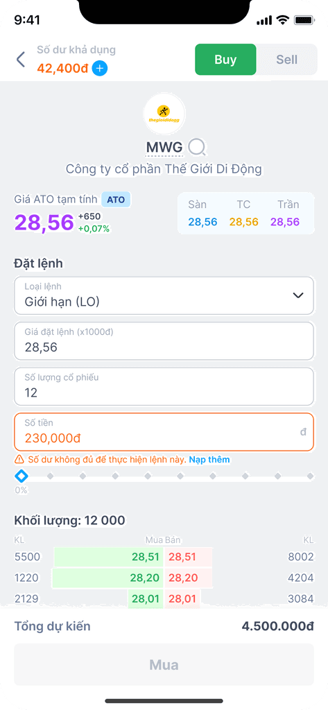
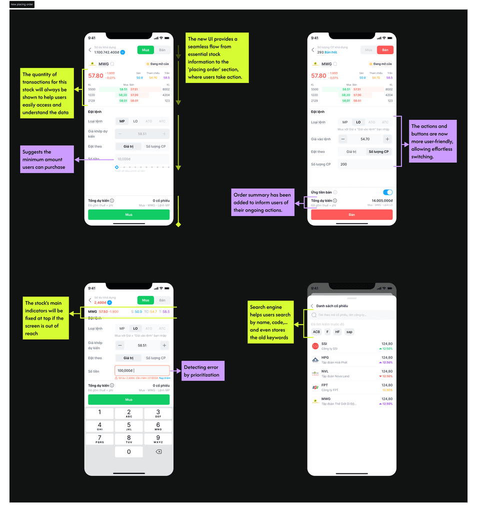
Solution & Design / Final UI
WORKGROUND
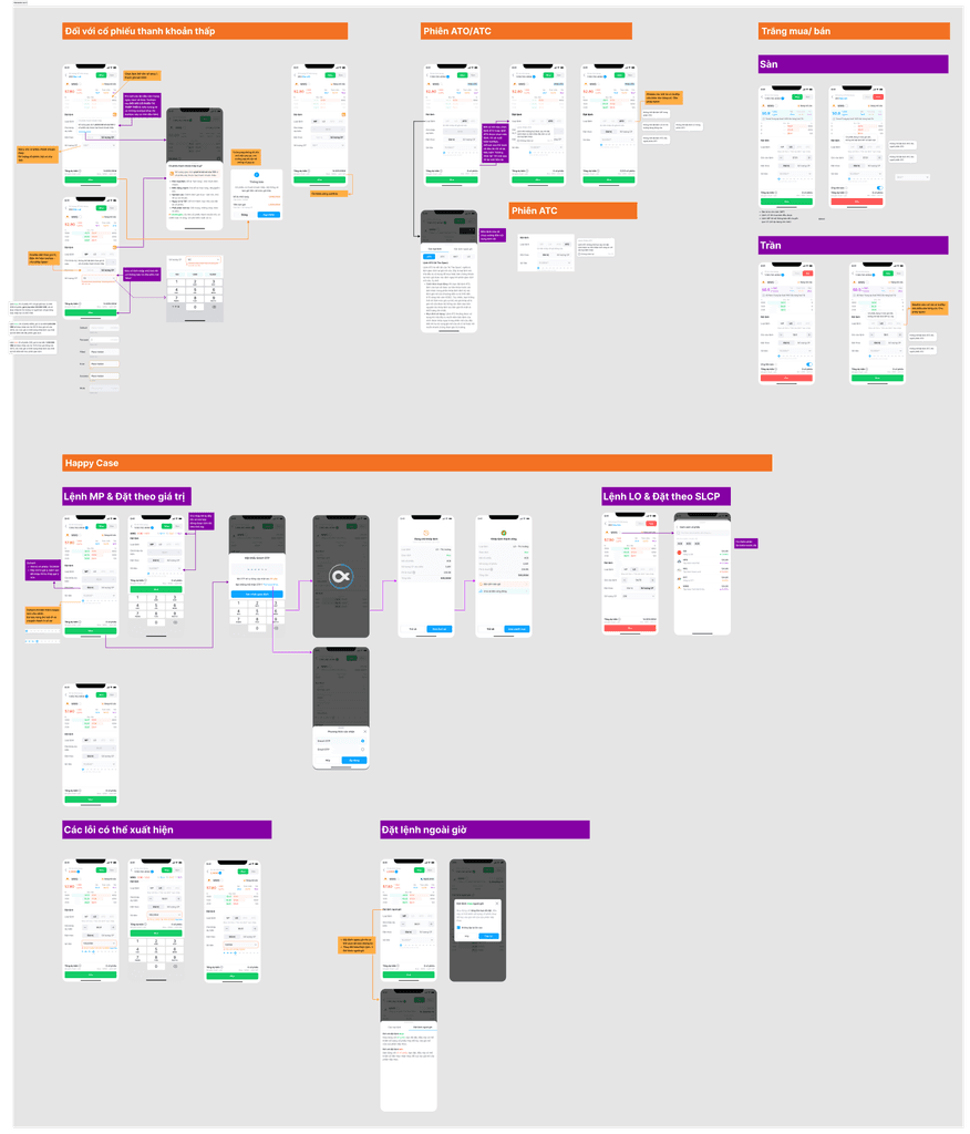
This is the full placing order flow. Due to confidentiality, I can't share the entire process, but below are a couple of key screens showcasing how users place and edit an order.
Solution & Design / Final UI
FINAL UI (REAL TOUCH n DESIGN FILE)
LAST STAGE
PROBLEM DISCOVERY
UX Audit
User Interview
Competitor Audit
PROBLEM DISCOVERY
Quantitative result
Quanlitative result
SOLUTION & DESIGN
Problem Prioritization
UI Iteration
UI Final
REQUIREMENT & DEVELOPMENT
Adjust order matching mechanism
Document & Requirement
RELEASE REQUIREMENT DOCUMENT
Test & tracking


