SCROLL TO EXPLORE
Type
Feature improvement
Status
Lauched
Domain
Fintech: Commodity
Duration
3 months
Year
2024
Services
Mobile App
What is AnfinX?
AnfinX is a trading platform that simplifies derivative trading in Vietnam, helping both new and experienced traders place orders and understand the market with ease.
Problem
In Q3 2024, AnfinX was still new to the Vietnamese commodity market, with only a small number of users. To grow our user base and boost engagement, the company aimed to develop improved versions of the app. Since the first release was just an MVP, it had several critical issues — including poor visual design, unclear UX flows, inconsistent color schemes, and missing key information.
Soltuion
We focused on enhancing the UX of the homepage and related pages to make the app more user-friendly, allowing users to find the information they needed quickly and smoothly. On the UI side, the design needed to be more modern with a clear visual hierarchy to improve readability and overall experience.
TEAM PROCESS
Our process combines Lean UX and the Triple Diamond Methodology. As both Product Designer and Product Owner, I guide the project to balance user needs with business goals.
Following Lean UX, we simplify tasks to reduce complexity and costs, avoiding unnecessary features.
The process may take longer due to factors like validation, challenges, or necessary iterations
(*) 1 user story = 8 hours

PRODUCT

Designer
Tai Truong
me
Product Owner
Tai Truong
me
TECH
DT
BE Developer
Dat Tran
HT
Mobile dev
Huy Tran
DT
Mobile dev
Duy Truong
DL
Mobile dev
Duy Le
QC/QA
QH
Tester
Quynh Ho
VT
Tester
Van Tan
STAKEHOLDERS/ REPORTER
HN
CTO
Hiep Nguyen
TL
Legal team
Thuy Le
GN
Investor regulation
Giang Nguyen
etc.
Other teams
Tri, Dat, Tan,...
DATA TEAM
NN
Data team
Nin Nguyen
LET'S GO AROUND MY PROCESS
PROBLEM DISCOVERY
UX Audit (You start here)
User Interview
Competitor Audit
PROBLEM EXPLORATION
User Needs
Current Problems
SOLUTION & DESIGN
Problem Prioritization
UI Iteration
UI Final
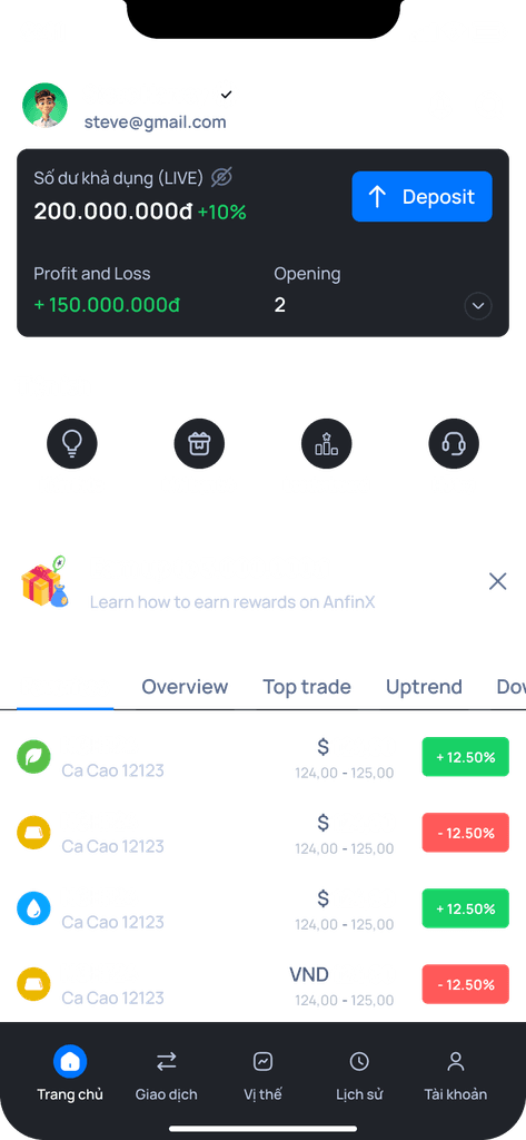
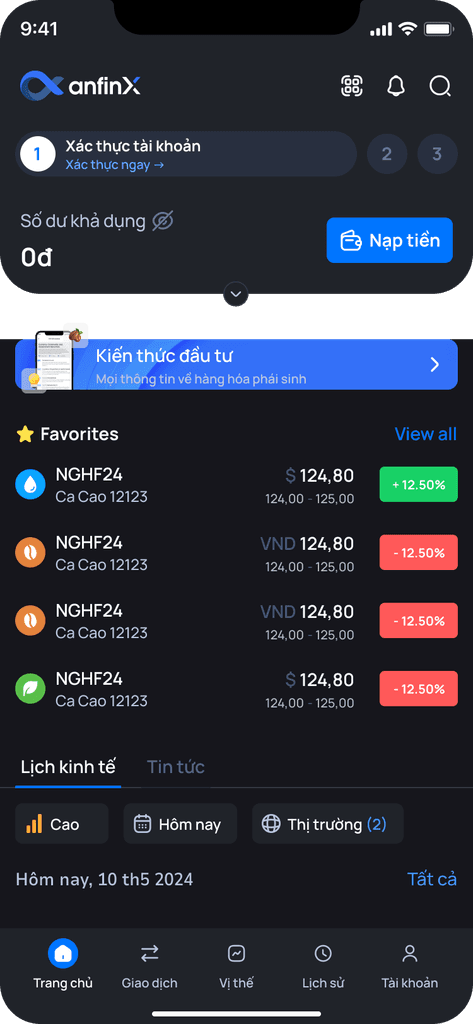
Problem discovery / UX Audit
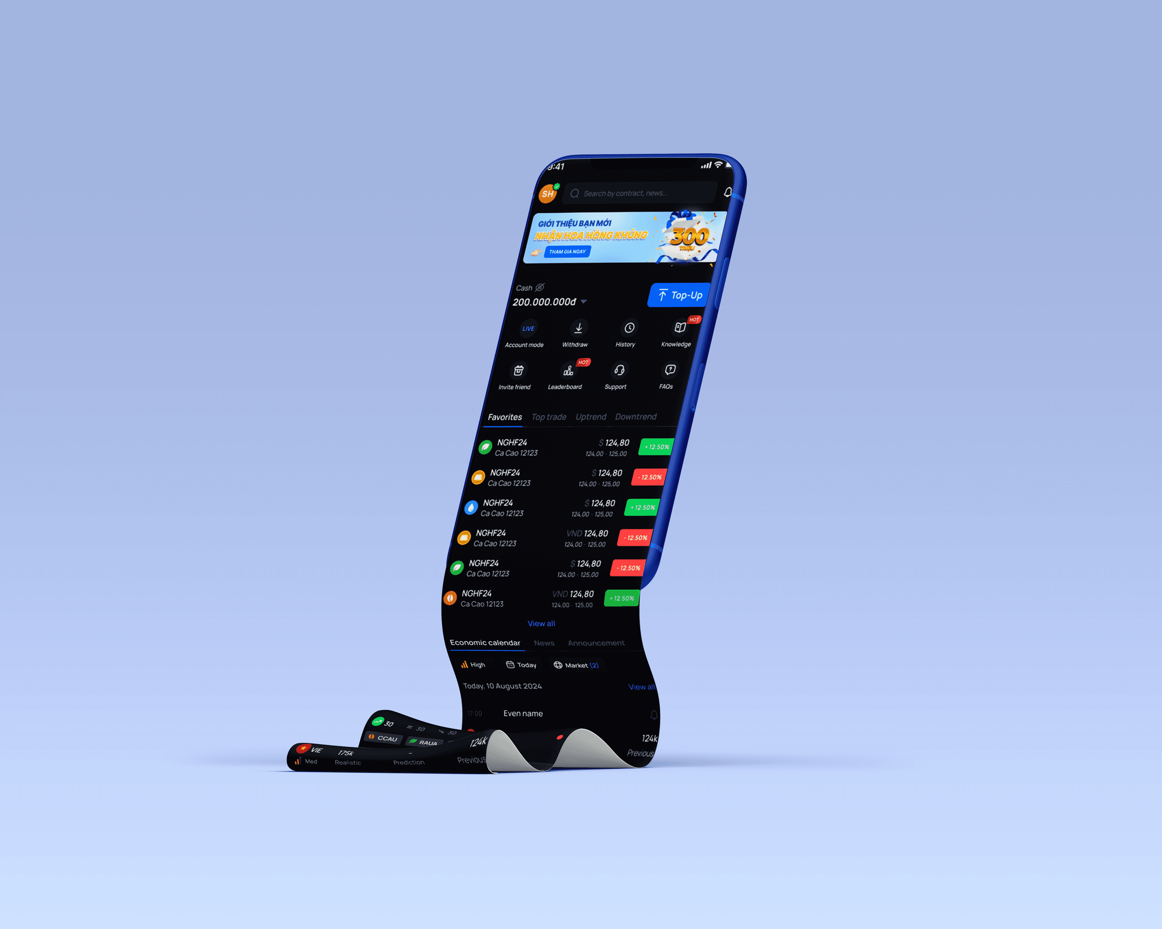
HOMEPAGE
1
The banner is quite old-fashioned
2
The balance amout here looks like an e- wallet. We aren’t the e-wallet,we are the commodity trading app.
We need give more and more information about commodity to our users target. This means, we facilitate user to follow the market or learn more about commotity based on their curious
Doesn’t have the account information
3
This section is useless for broker and trader
4
This section is quite boring and not suitable with a trading app.
It's soft and weakness
5
The “History" tab isn't used by users in most of cases. -> it's be placed on the account page or somewhere to give way to the other function one
Problem discovery / UX Audit
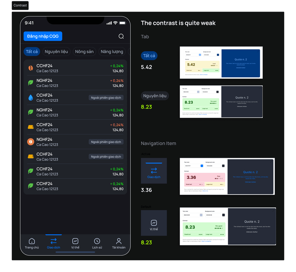
LIST OF COMMODITIES
1
The current version one is fairly enough for trader but the way that users to see what role they are is hided.
This means, if users want to know what role they are, they have to click on the arrow to many times
2
The contrast here is so weak
3
The style of the tab is inconsistent with the box beneath it. One is curved and features a background color, while the other is rounded and features a line.
4
It is difficult to provide further information with this appearance. Additionally, the icons of the industry are inconsistent.
5
The monitor is big and brighten than mobile that's why in computer we can see the information easily.
6
The contrast of menu's selected tab is quite hard to see
Problem discovery / UX Audit
COLOR & CONTRAST
Problem discovery / User Interview
INTERVIEW AMONG TEAM MEMBER
In the early stage of our product, we had only a few users. So, I conducted quick interviews with a few colleagues in the office. I also gathered feedback from my team and other departments not directly involved in the product, such as Legal, Accounting, Customer Service, and Investor Relations,…

Member
Feedback
Anh Hiệp
(CTO)
“Top trade” doesn't affect with his decision.
Sometimes he wants to view how the market change (Agriculture/ energy/material volume
Doesn't care about “top trade” because he just need to follow the positions he placed
Economic calendar and news are quite useless in making decision
(add more in brainstorm)
Thy (BA)
The current Homepage looks like a e-wallet.
As a new trader in commodity, I don't know what values that economic calendar help for my decision (personally)
Received so many information and good suggestion from team members but need to be clear
Has a thought that the “top trade” has the high-price positions, so those positions are not affordable with her balance
Chị Giang
(Investor relation)
Banner is borring
Feels the “introduction & FAQs” is useful for newbie but, it's nice to have.
Want to change “Top trade” → “Watchlist”. She doesn't care any contract on the “top trade”
Chị Thuý (Legal)
Color and layout are OK, easy to use, prefer AnfinX to Anfin because Anfin has many information.Feels the “introduction & FAQs” is useful for newbie but, it's nice to have.
Need to be as clear as possible in the walk-though new user process. Add the hotline in the tooltips in each step of walk-through user program, because she wants to know why she got that problem (in step 2)
The economic calendar and news are useful for her decision
Chị Trang (HR)
Color and layout are OK, easy to use, prefer AnfinX to Anfin because Anfin has many information.Feels the “introduction & FAQs” is useful for newbie but, it's nice to have.
Need to be as clear as possible in the walk-though new user process. Add the hotline in the tooltips in each step of walk-through user program, because she wants to know why she got that problem (in step 2)
The economic calendar and news are useful for her decision
Problem discovery / Competitive Audit
LEVEL 1: Trading app with basic style
These apps had only basic designs, so I didn’t focus too much on them.
LEVEL 2: Wallet and basic trading app
Exploring them helped me gain broader insights into fintech applications.
LEVEL 3: Most famous apps and big corps
Apps like Binance and OKX are well-known among traders, and studying their user flows gave me valuable learnings.

LEVEL 4: Having the same services
These apps were our main competitors, also operating in the commodity derivatives space.

Problem exploration
INSIGHT AND PROBLEMS
"Top Trade" Section Feels Irrelevant
Many users don’t find the “Top Trade” section helpful.
Some think it displays high-priced contracts that are unaffordable.
Others focus only on their own positions or care more about market trends and volume rather than top performers.
Economic Calendar and News Lack Clarity
Users, especially beginners, don’t clearly understand the value or impact of this information on their trading decisions.
It feels disconnected from their actual trading behavior.
Homepage Layout Feels Misaligned
The current homepage gives the impression of an e-wallet rather than a trading platform.
The banner is seen as boring or lacking engagement.
Introduction and FAQs are considered useful but too lengthy or overwhelming.
Pricing Perception Affects Engagement
Some users feel discouraged when seeing high-priced contracts, assuming they can't afford to trade them.
This leads to the assumption that the homepage content isn't tailored to their needs.
Onboarding and Walkthrough Need Improvement
The walkthrough process is unclear for some users.
There’s a need for better guidance or direct support (e.g., hotline/contact support) embedded in each step.
WHAT I SHOULD DO?
Redesign the "Top Trade" Section
Clarify the Economic Calendar & News
Improve Homepage Layout & Visual Hierarchy
Enhance User Onboarding
Address Affordability Perception
YOU ARE BEING MOVED TO THE NEXT STEP
PROBLEM DISCOVERY
UX Audit
User Interview
Competitor Audit
PROBLEM EXPLORATION
User Needs
Current Problems
SOLUTION & DESIGN (You're here!)
Problem Prioritization
UI Iteration
UI Final
Solution & Design / Problem Prioritization
PROBLEM PRIORITIZATION
Through some course and self-learning, I knew to classify what I should do by "Low Cost - High Impact Method". There was a formula but I think it took me too long, so I just did it inside my head. I'd show you in the interview
Solution & Design / Iterations
CREATE MANY OPTIONS

I organized several meetings to present my ideas and gather feedback from the team, helping us refine and improve the product further.

Solution & Design / Final UI
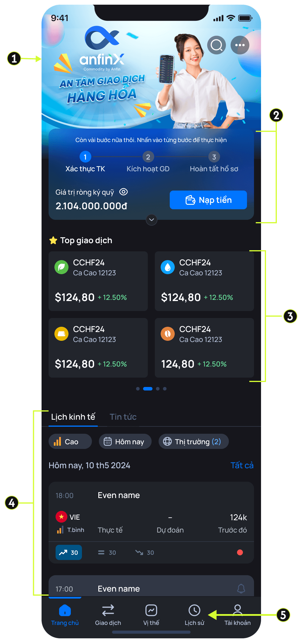
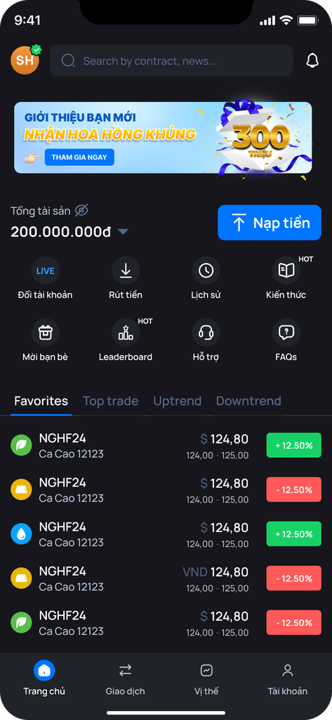
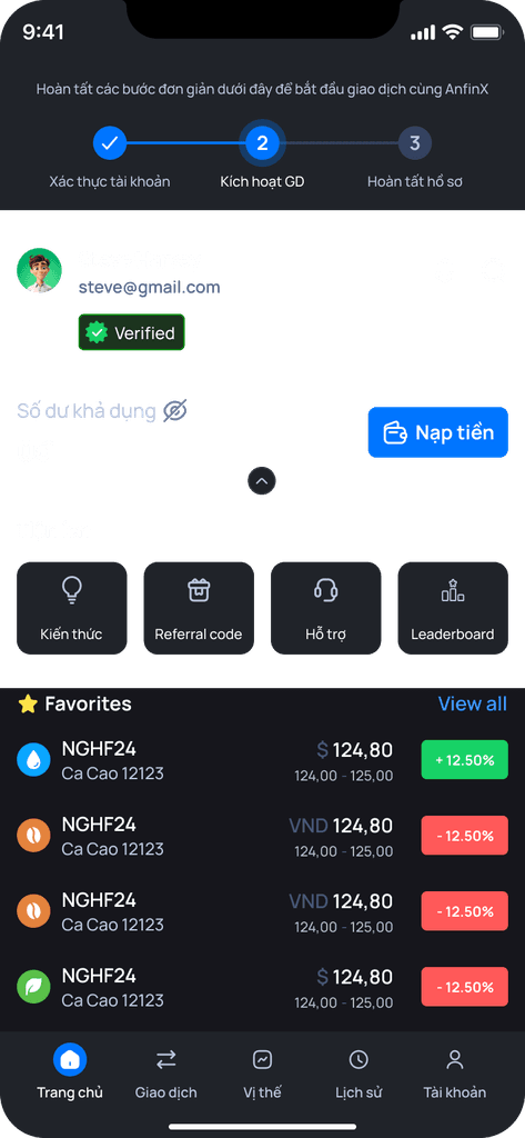
HOMEPAGE NEW VERSION
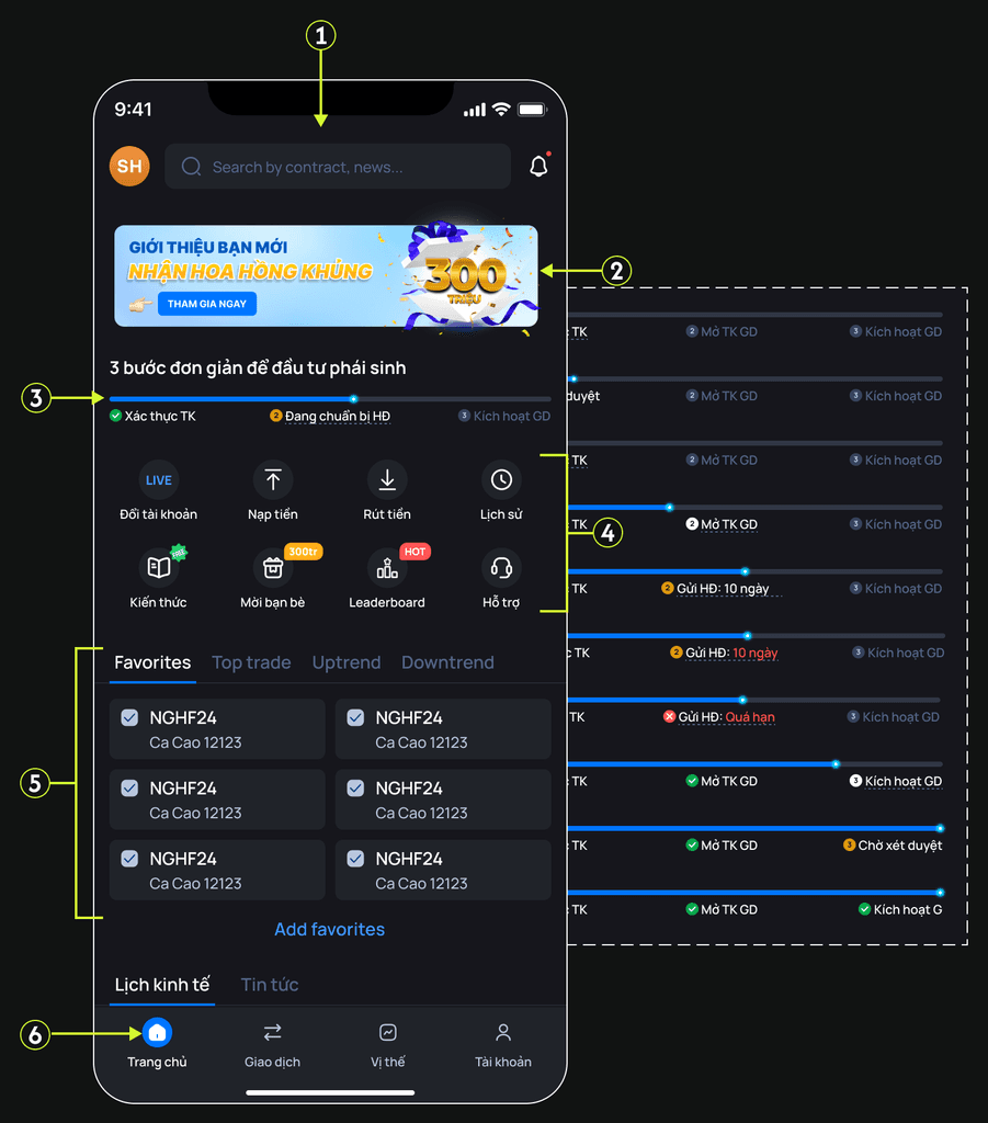
1
The latest version included a smart search feature, and users can now see their avatar on the homepage.
2
The banner was simplified but still highlighted the most attractive promotion of our product.
3
The eKYC flow was streamlined by removing redundant infomation, and the UI was optimized to guide users effectively through account verification.
4
A new section was added to host more features, making it easier to expand functionality and showcase our unique selling points.
5
The watchlist was introduced based on user demand, and we also highlighted beginner-friendly commodities suitable for new traders.
6
The contrast has been significantly improved, helping users better understand where they are within the app.
More of hompage

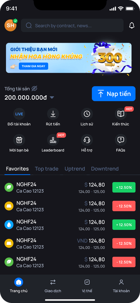


Solution & Design / Final UI
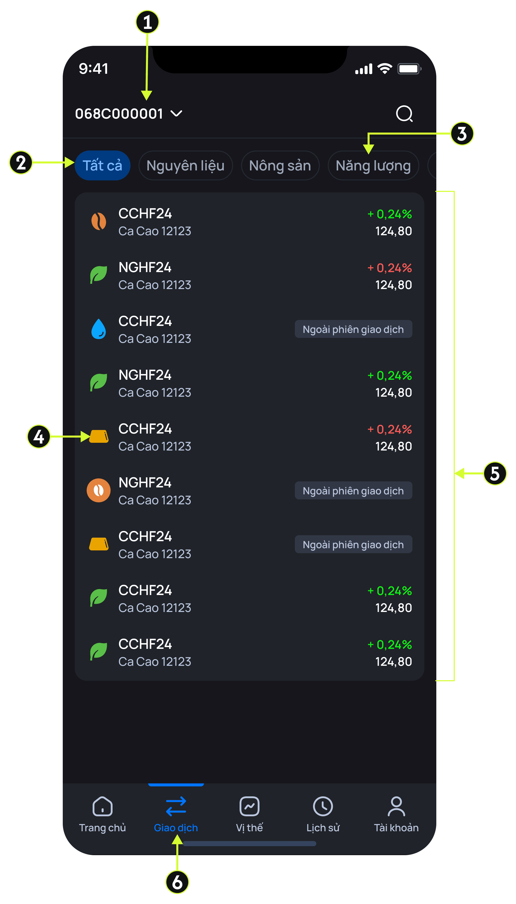
TRADING TAB NEW VERSION

1
Since commodity margin requirements are quite high, we added a filter to help users find items that match their available balance.
2
The contrast between tabs is now clearer, making it easier for users to recognize where they are.
3
Overall, the list layout was significantly improved. Users can now easily digest key information for each commodity, with more relevant and efficient details.
4
With new version, users can switch mode Demo/Live easily. Even though, they can quickly manage their balance.
TESTING AND TRACKING


